
TOP is developing a new population projection tool for the United States, based on US Census Bureau methodology and data. Check it out! You can run your own US population projections under different fertility and immigration scenarios — and help us improve the projection tool with your suggestions.
by Philip Cafaro
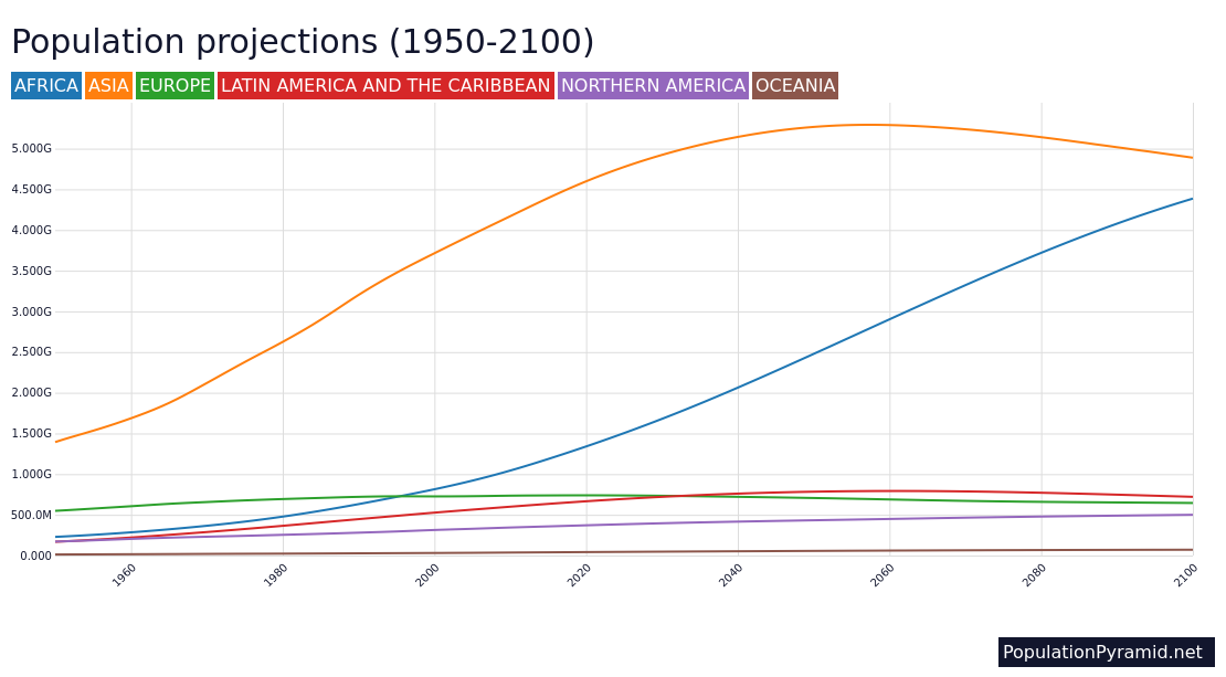
One of our more satisfying TOP projects over the years was creation of the TOP Grapher, by software developer Balázs Forián-Szabó. Built around policy-based EU population projections published in 2019, it allows visitors to see the impacts of changes in immigration and fertility rates on future population numbers for all 27 member countries of the EU, plus the UK and the EU as a whole.
Now I and my son Henry, a graduate in math and computer science from the University of Chicago, are creating a new population projection tool for the United States, using standard cohort-component projection methods. It duplicates the methods and parameters set by the US Census Bureau in their most recent (2023) US population projections, closely replicating Census Bureau results under their chosen fertility, mortality, and immigration scenarios. This new projection tool allows users to make your own projections by varying fertility and net migration rates as desired.
Click here or on the pictures below to pull up a rough prototype of the projection tool. The first picture graphs the US population out to 2100 under three different immigration scenarios: 1, 2 and 3 million annual net migration. Note that in a mere 75 years, those three plausible annual immigration scenarios generate a spread of 257 million in the 2100 US population, from 383 to 640 million.

Play around with this new projection tool and see what you think. Suggestions for improvement and added features are welcome. Note that it may take a moment for the projection tool to load and for the individual projections to run — we’re working on speeding that up!
In the current iteration, you can graph three projections at a time, facilitating comparisons. For example, in the past few years net immigration into the US has reached its highest levels ever. From an average of about 1.5 million under the Trump administration (and a low of 1 million during its last year, during the Covid emergency) net annual immigration is currently running over 3 million under President Biden. Whether we choose Trump-scale or Biden-scale immigration levels could make a difference of hundreds of millions to future US population size (see below).

Graphing the Trump and Biden projections shows that current immigration policies could increase the US population by 300 million by 2100 — from our current 340 million population to 640 million people in just three generations. Even Trump-level net immigration levels could increase our population by 100 million during that time. Arguably, US immigration levels should be reduced, so that we can stabilize or lower our population, as part of creating a sustainable society.
For Americans who consider ourselves committed environmentalists, it is worth asking whether the generally more environmentally-friendly policies of Democrats are worth the environmental costs of Democratic immigration policies, given the damage that hundreds of millions more Americans will inevitably inflict on our forests, wetlands, and native biodiversity.
Note that you can also vary fertility rates using the new projection tool, exploring how higher or lower rates influence future population numbers, and the relative importance of changes in net migration versus changes in fertility rates. The current US total fertility rate (TFR) is 1.7. You can also graph changing fertility and immigration rates, following the instructions provided. Enjoy — and don’t forget to tell us what we’ve gotten right and what we need to improve, in the comments section below.


Leave a Reply