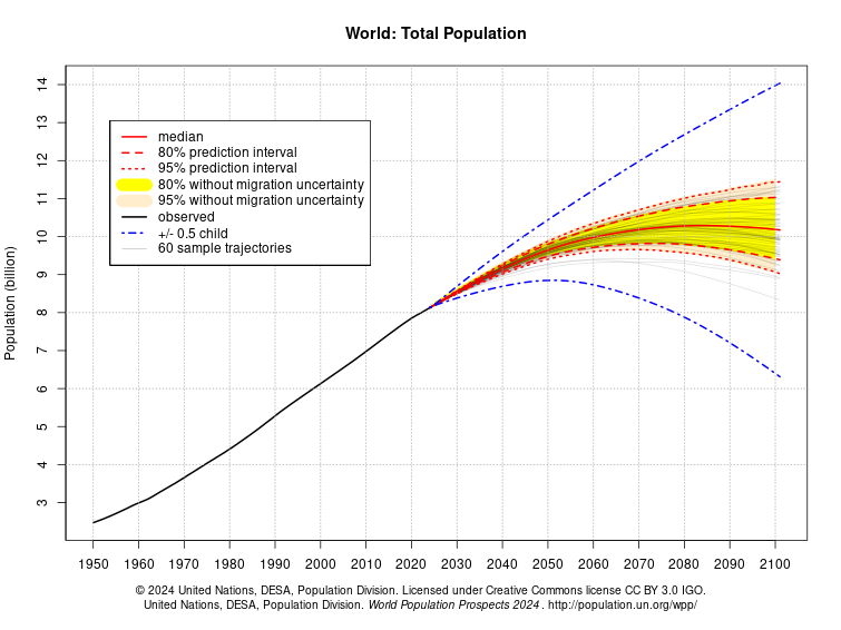
TOP provides population projections under nine different fertility and migration scenarios (and their varied combinations) for every country in the EU out to 2100, in order to illuminate policy choices and their demographic consequences.
Project and compare European countries’ population projections and population densities on our interactive chart:
Using the Top Grapher is easy. Click on the plus sign in the lower right hand corner to pull up a list of all 28 EU countries. Choose a country (or the EU as a whole), then choose among any combination of five different fertility and five different immigration scenarios to graph. You can also graph scenarios from two or more countries at the same time. When you have chosen which countries and scenarios you want to graph, click the X in the upper right hand corner and the TOP Grapher will run your customized graph.
If you want to know the population for any year under any scenario, just move your cursor over the graph and you can see it. There is also a toggle switch in the upper right hand corner, allowing you to convert your results from population size to population density, or back. This feature should prove especially valuable to environmentalists, since some environmental impacts are primarily a function of total numbers (like greenhouse gas emissions), while others are more a function of changing population density (like biodiversity loss).
How do these projections differ from others, such as the UN’s projections, or the efforts of the various national statistical bureaus? Most importantly, they are policy based, clearly linking current policy choices to future population sizes. For example, they allow users to compare the possible impact of more or less generous economic safety nets on future fertility rates, and in turn, the impact of higher or lower fertility rates on future national population sizes.
Wondering whether your country is set to grow or decline under status quo population policies? How many million people doubling France’s immigration level would add to its population by 2080? Whether cutting the Netherlands’ or Hungary’s immigration in half while improving their family support services would lead to bigger or smaller populations than their status quo policies? Well, wonder no more. Run the numbers for yourself!
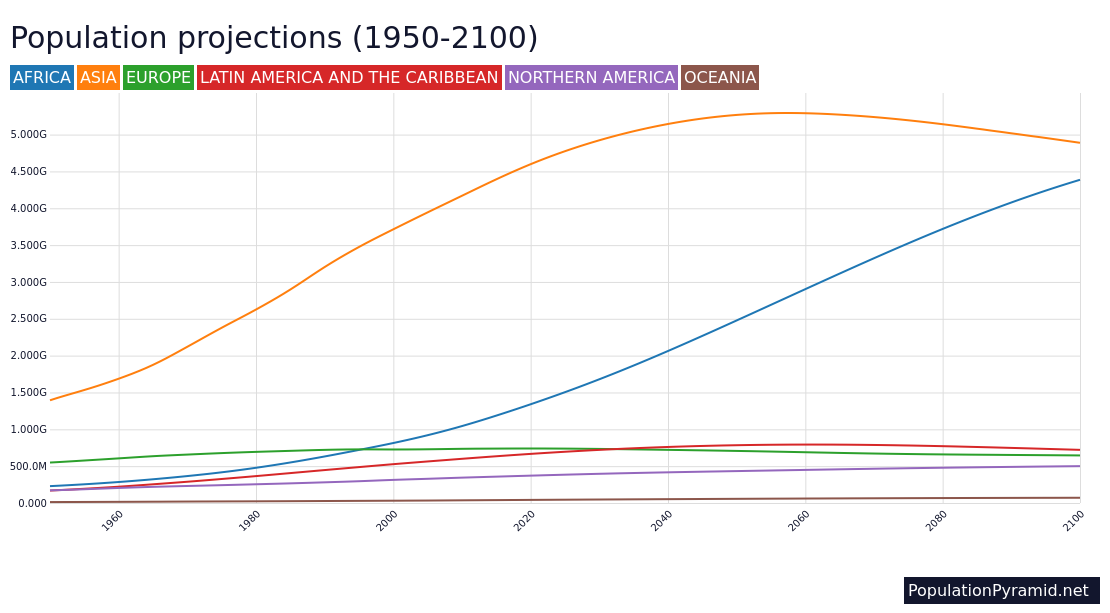
Visualization by Balázs Forián-Szabó, based upon the Our World in Data grapher. Projections by Patrícia Dérer and Philip Cafaro, published as “Policy-based Population Projections for the European Union: A Complementary Approach,” Comparative Population Studies 44 (2019): 171-200. Full projections for all EU countries and the EU as a whole in appendix III.